(Case Study)
Multi-Brand Sales Design System
Consolidating 12 fragmented tools into 33 reusable components across a multi-brand neurological portfolio. Adoption climbed from 65% to 92%.

“Designing for an audience that might have 45 seconds versus six minutes versus sit down for a cup of coffee, 12 minutes, you really have to be agile.”
The challenge
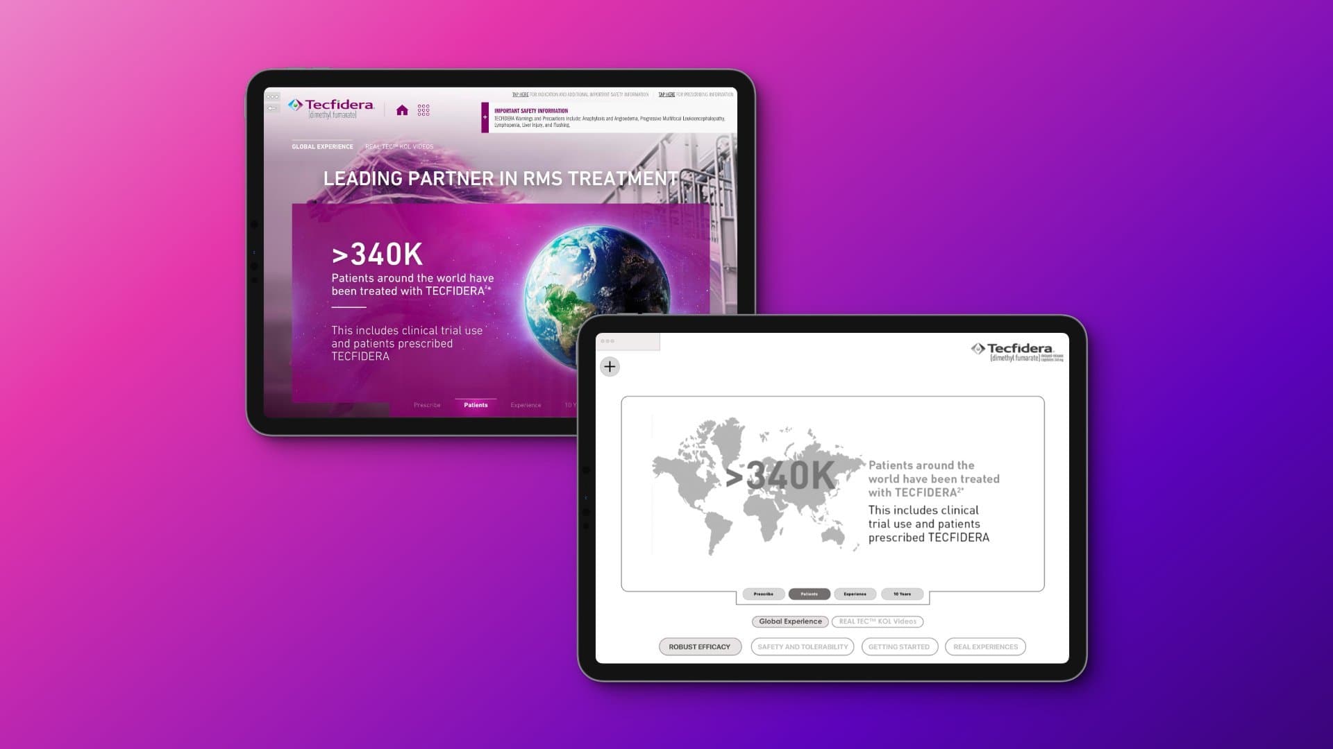
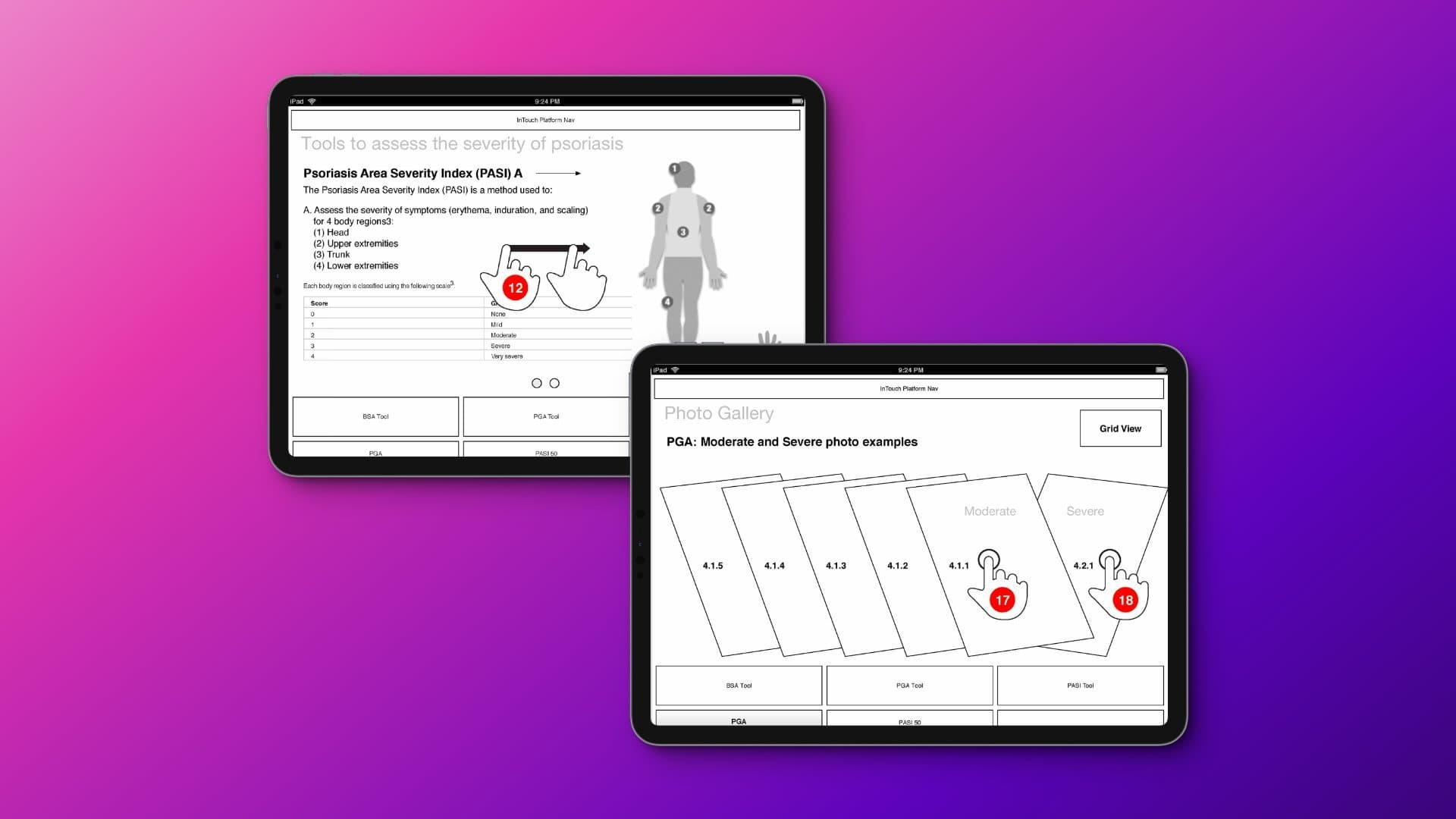
Pharmaceutical sales reps were juggling 12 different sales tools across a major neurological brand portfolio. Each tool had its own navigation, its own taxonomy, its own visual structure. All of them ran on Veeva with Salesforce integration, but they weren't operating as a system.
Reps had to relearn navigation every time they switched products. Brand managers maintained independent approaches that drifted further apart with each release. Regulatory reviews repeated similar conversations across separate tools. Development resources were duplicated across teams who weren't talking to each other.
The friction wasn't obvious to executives. But it was costing time, money, and the confidence reps needed in conversations with healthcare providers, conversations that often ran 45 seconds to six minutes to a 12-minute coffee chat, with no way to predict in advance which version it would be.
“The consistency made their job easier.
The field notes feature let them pick up where they left off and know what to send to the office post-call.”
I came onto the engagement at the pitch stage, helping define the opportunity, prototype the proposed system, and ultimately win the business. Once the work was won, I partnered with brand managers internally to map components to each brand's particular content needs, and with development teams to ensure templates and design system rules would scale across the current portfolio and through future product indication expansion.
The result was a modular enterprise design system. Thirty-three reusable components. Unified navigation structure. Standardized taxonomy. Flexible content architecture that supported both 45-second elevator pitches and six-minute deeper conversations. Salesforce-integrated interaction tracking. Embedded resource-sharing pathways for PDFs, video, and rep-to-HCP follow-ups. Built-in field notes for pre-call planning and post-call follow-up.
Brand teams could still express campaign identity. But inside a governed design system. The result wasn't uniformity. It was structured flexibility.
The harder work was organizational. Brand managers had to give up some autonomy to gain shared infrastructure. Regulatory teams had to trust pre-approved components. Development teams had to commit to the framework instead of building bespoke solutions on every brief. None of that happens because the system is well-designed. It happens because the governance is.
(Process)
The walk-through


Starting with structure: content map plus atomic foundation
Two architectural maps governed everything that followed. The atomic design framework defined how UI scales from atoms to molecules to organisms to templates to pages. The sitemap defined how content was organized across the brand's therapeutic territory: pivotal trial, comparative efficacy, safety, MRI, newly diagnosed, response. Before any pixel was designed, these two maps determined what the system could become.
Swipe or tap arrows to navigateUse ← → keys to navigate
Selected outcomes
12 sales tools consolidated into 33 reusable components
A modular framework that brand teams could compose into custom presentations while maintaining unified navigation and standardized taxonomy.
40% reduction in search time
During sales rep conversations with healthcare providers. Reps could navigate the system instinctively instead of relearning each tool.
60% faster onboarding for new sales representatives
Once the system was learned, it worked the same across every brand. New hires reached productivity faster.
45% reduction in development and maintenance costs
Through standardization. The system was built once and served many. Brand teams added campaigns without rebuilding infrastructure.
Tool adoption increased from 65% to 92%
Within 12 months of system launch. Reps used the tools because the tools worked the way reps actually work.
Regulatory review cycles simplified
Pre-approved components eliminated duplicate review conversations across brands. Speed-to-market improved at the system level, not just per launch.
Built once. Designed to scale.
Serving the current portfolio and ready for future brand launches without rebuild.

Most enterprise system failures aren't design failures. They're governance failures. The components were never the hard part. The hard part was getting brand teams, regulatory teams, and development teams to agree on the cost of fragmentation and the value of doing the work together.
The design system was built once. It serves many. That's the difference between design that scales and design that fragments.
Working through similar fragmentation?
Related work
Continue reading
Multi-Brand · 3x Design Systems · Governance
Building digital governance across 70+ therapeutic brands
$3.5M+ in digital transformation. Industry-first mobile wallet integration for patient medication information.

Bloomberg · Terminal Environment
Redesigning CRM workflows inside a terminal-driven enterprise environment
Architectural inquiry with three rep types. Faster scanability, quicker decisions, measurable time-in-task reduction.