The book
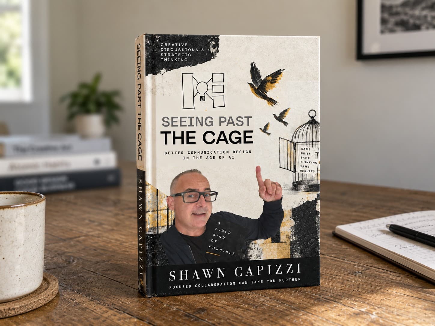
Seeing Past the Cage
Better communication design in the age of AI
I wrote this because I got tired of watching design leadership become a thing people talk about instead of do. Fifteen years in the trenches of New York agency life taught me something different: the best people don't complain about the seat at the table. They earn it by pushing the work forward and owning the outcome. This book is what I learned from them, and from a path that's been anything but typical.
It's one person's hard-won take on smart design: why clarity wins, how to cut through the noise, and what it takes to do great work in the rooms where it actually gets decided.
The book is written. The foreword is below. Read it free. I'll send you the finished book when it's ready, plus the occasional note from the work in between. Get on the list →
Inside the book
What's in Seeing Past the Cage.
Four parts, each opened by a pillar. The foreword is free below. Select a part to see what's in it.
4 parts15 chapters4 pillars
- Opens with
- Foreword: The Human Condition
- Introduction: From Crayons to Code
- Closes with
- Conclusion: Principles for Professional Excellence in the Democratic Design Era
Strategic Design in Complex Organizations
From Individual Craft to Integrated Systems
- 01Visual Design & Content Strategy FoundationIn the book
- 02Strategic Positioning & Discovery MethodologyIn the book
- 03User Personas & Purposeful SegmentationIn the book
- 04Community Design Principles for 2027In the book
The book is written. Get the next chapter when it's ready.Get on the list →
Foreword
The Human Condition
Why empathy is the foundation of digital experience.
Muddling Through: The Universal Experience of Being Human
In the classic holiday song “Have Yourself a Merry Little Christmas,” there's a line that captures something profound about the human experience: “Until then we'll have to muddle through somehow.” It's a gentle, almost whispered acknowledgment that life is often about persevering through uncertainty, about navigating challenges we didn't see coming, about getting by while we wait for better days.
This idea of “muddling through” isn't just poetic, it's the reality for most people interacting with your digital products. They're not coming to your website or app during their peak moments of clarity and calm. They're coming while dealing with a medical diagnosis, after learning their rent increased, while their car is broken down and they need to get their child from school. They're coming with invisible burdens, temporary crises, and the accumulated stress of a full life.
Taylor Swift's “Out of the Woods” asks the same fundamental question that echoes through the human condition across time and place: “Are we out of the woods yet? Are we out of trouble?” It's about stability, clarity, and the universal desire to know if we've moved past the point of difficulty. Whether it's a relationship, a financial crisis, or simply trying to use a transit app to get home, we're all constantly asking: Are we through the hard part yet?
Every user who reaches your product is carrying some version of that question.
The Weight of Universal Experiences
The list of what people might be dealing with extends far beyond financial stress or work pressures. Divorce, separation from a partnership, the fragility of pregnancy, the heartbreak of a miscarriage. These are profound life events that completely reshape how someone moves through the world, including how they interact with digital products.
These experiences have peaks and valleys, and most importantly, they come with ongoing education and learning. Someone dealing with divorce isn't just sad one day and fine the next. There are good hours and devastating hours, sometimes within the same day. Someone navigating pregnancy might feel hopeful in the morning and anxious by evening. These emotional states are fluid and unpredictable.
People are constantly learning how to cope with these experiences, seeking information, trying to understand their options. They might be researching lawyers, looking for support groups, reading about medical procedures, or simply trying to figure out how to tell their family. Your product might be the tool they use during these vulnerable moments of learning and decision-making.
What's crucial to understand is that these experiences are truly universal. They cut across economic lines, demographics, and customer tenure. The executive who's been using your B2B platform for years might be going through a separation. The new user signing up for your health app might have just experienced pregnancy loss. Rich, poor, new to your funnel, or in your customer journey since day one. Everyone carries these invisible weights.
The Fragility of Context: How Quickly Everything Changes
A user's emotional state and life circumstances can shift as quickly as yours or those of people you love. You can wake up having a great day, take that first sip of coffee from your favorite café, and if it's too hot, suddenly your entire context changes. The pain, the spill on your white shirt before an important interview, the frustration of it. It all cascades into how you'll interact with every subsequent experience that day.
When your car breaks down while you're trying to pick up your child from school, your mental model shifts instantly. You're no longer a casual browser of information; you're someone in crisis mode who needs solutions fast. Something that was easy, clear, and direct becomes essential rather than convenient.
These context shifts happen constantly, and they're often invisible to the teams building digital experiences. What seems obvious and intuitive to a product team working in a controlled environment becomes impossibly complex to someone who's having their 47th decision of an overwhelming day.
This is where empathy becomes not just nice-to-have, but business-critical. People interact with products when they're stressed, rushed, worried, grieving, angry, or simply mentally exhausted. If we design assuming users are always in that ideal “before the coffee burns their tongue” state, we're failing the majority of real human moments.
When Innovation Lacks Empathy: The Hidden Cost of Digital Disruption
Context shifts aren't just personal. They happen at the product level too. When companies undergo redesigns, often driven by new design leadership or creative agencies, there's frequently a disconnect between innovation and empathy. Teams will “blow up” existing experiences, changing nomenclature, button colors, layout, and navigation conventions without considering the human cost.
Users aren't just adapting to new features; they're grieving the loss of familiarity. Someone who could previously navigate your app while distracted or stressed now has to relearn it when they might already be having their worst day. This approach essentially tells loyal users that their investment in learning your system was worthless.
True empathy in redesign means auditing current patterns and carrying over the best and most useful elements. It means understanding that people rely on digital tools as stable anchors when everything else feels uncertain. When you suddenly change that anchor without consideration, you're adding stress to someone who may already be overwhelmed.
The Anchor in the Storm: Lou Reed and the Power of Repetition
Lou Reed understood something fundamental about human nature in his song “It's a Temporary Thing.” The repetition of the hi-hat, the insistent reminder that “it's only a temporary thing”, it creates a grounding rhythm that cuts through chaos. The repetition isn't just musical; it's meditative, like a mantra that helps us remember that pain passes, stress shifts, circumstances change.
That isn't just a songwriting trick. It's an interface principle. When someone is already overwhelmed, the last thing they need is novelty. A pattern they've seen a hundred times asks nothing of them. It's the closest a screen gets to a steady hand on the shoulder, a quiet reassurance that they still know where they are and what comes next.
Design for the temporary crisis, the temporary confusion, the temporary pain. Because if your interface works for someone having their worst day, it'll work brilliantly for someone having their best day too.
The Curse of Expert Knowledge: Designing for No Context
One of the biggest barriers to empathy in product development is the curse of expert knowledge. When you live and breathe your product every day, you forget that industry jargon and assumed knowledge mean nothing to someone who just needs to pay their electric bill or check their prescription status.
The most valuable exercise any product team can do is to disconnect completely and experience their own product with zero context. Drop yourself into your marketing communications, your website, your app as if you've never seen it before. Can you quickly understand: This is what we are. This is what we do. This is how we can help you solve your problems. This is how you complete a task.
This extends to language accessibility as well. Someone dealing with a medical crisis doesn't have the mental bandwidth to decode corporate jargon. A parent trying to figure out school payments at 11 PM after a 12-hour workday needs second-grade reading level clarity, not MBA-speak. For global companies, this means considering not just English and Spanish as baselines, but the languages of your actual users, whether that's Korean, Russian, Polish, or others.
Language barriers compound stress exponentially. Imagine being that person whose car broke down while picking up their child, AND they're navigating an interface in their second language, AND the instructions use unnecessarily complex terminology.
The Nuance of Digital Tone: Reading Between the Lines
As customer experiences become more tailored and personalized based on data, the ability to interpret digital tone becomes crucial. The way AI can interpret your input versus the way a friend sitting across from you in a café can appreciate tone, intent, emotion, character, and even regional dialect creates both opportunities and challenges.
Consider the spectrum of gratitude: “thanks” versus “thank you” versus “yeah thanks” versus “sincerely, I sincerely thank you.” Each carries completely different emotional weight. The first might indicate efficiency or someone who's rushed. The second shows more formal respect. “Yeah thanks” could signal casualness or slight dismissiveness. The formal “sincerely” version suggests genuine gratitude, possibly from someone of an older generation or a non-native speaker.
These tonal nuances reveal context clues about the person's state of mind, cultural background, and relationship to your brand. But as we grow more sophisticated in reading these signals, we walk a fine line between helpful personalization and invasive surveillance.
The Privacy Paradox: Personalized but Not Creepy
One thing to keep in mind as we strive for personalization: we don't want to come off as a peeping Tom. Users should never have that “I didn't know they knew that about me” reaction. There's a narrow sweet spot between helpful and creepy, often defined by user expectation versus brand knowledge.
When someone explicitly shares information or preferences, using that feels helpful. But inferring too much from behavioral data, like knowing someone's 2 AM browsing habits and sending a “having trouble sleeping?” notification, crosses into uncomfortable territory fast.
Digital signals that brands can appropriately track and act upon include how long users take on a site, their response time, and interaction patterns. These reveal whether someone is highly focused, whether navigation is clear, and whether they understand what they can accomplish and how to accomplish it. Someone clicking rapidly through pages might be frustrated or very familiar with your product. Someone lingering on a form for ten minutes might be confused, dealing with complex circumstances, or simply multitasking.
These patterns tell you about the experience itself without crossing privacy boundaries. The empathetic response isn't always to intervene. Sometimes it's to simplify what users see next, or provide clearer visual hierarchy.
True Utility in a Full Life
The best way to ensure commercial communications and brands stay connected to user struggles is by literally listening to the market, talking to users, and analyzing data to understand where people actually go on websites and where gaps exist. But more fundamentally, it requires understanding that a user's life is full. They have to help their parents, get to class, buy gas, fold laundry, manage vacation plans, do their job, work late.
Your brand and product is not a celebration of their life. It has to be a true utility in their life.
This is the fundamental shift from ego-driven product development to truly empathetic design. The best products are the ones you barely notice because they just work, like a perfectly calibrated doorknob or a traffic light that turns green at just the right moment. They solve the problem and get out of the way.
People don't want to be delighted or engaged or part of a brand journey when they're muddling through life's challenges. They want the task completed so they can get back to living. They need products to be invisible handholds that help them climb out of confusion, not additional obstacles that make them feel stupid or excluded.
Redefining Success: When Invisible Utility Wins
As we create richer customer journeys grounded in empathy, we must redefine how we measure success. If true empathy means becoming invisible utility that helps people accomplish goals quickly, then traditional engagement metrics become counterproductive.
It's very important to understand and define your business goals currently with the touchpoints you have in market or will be updating. Then we can decide on what indicators will equal success. What metrics are we tracking? Keep it simple and targeted. We will check these particular things to gain X amount of information based on engagement or conversions, and then we will redefine and perhaps A/B test in the marketplace for insight A and insight B.
The amount of time spent on page, content sharing, and community engagement with particular information become better indicators of value. When someone shares your content or engages deeply with specific information, they're saying “this was so helpful I want others to benefit” or “this was worth my limited attention.”
This flips the engagement model from “how do we keep them here longer?” to “how do we help them so effectively that they remember us positively and return when needed?” The longer a user engages means there's greater value for them, but that engagement should be purposeful, not manufactured.
Grounded in Reality: Honest Metrics for Real Impact
To clearly define which metrics are self-indulgent versus which move business forward, we must stay grounded in reality. As teams build products, emotional attachment develops. There are stakeholder reactions, miscellaneous requests that appear from nowhere. If we're mature and honest about building products that serve true customer needs, we must provide some mechanism of reality.
Teams get emotionally attached to a design, to a picture, to a color combination. Even though that color combination might not be accessible or WCAG compliant, there are constituents on the team who still feel that's the best route. At this point in time, it's a vulgar display of ignorance.
Politics are part of life. Stakeholders hold different amounts of influence. There's necessary respect for those funding initiatives, department heads, presidents, CTOs. These people are responsible for multiple business initiatives. When they have hopes, dreams, or aspirations, alignment becomes crucial if they're funding your team's lifeline.
But getting back to empathy: each coworker, leader, stakeholder, and user has their own initiatives and priorities. We must be respectful collaborators, mentally, empathetically, and in our conversational tone. We must be honest with users and honest with stakeholders.
Staying Focused: Evidence Over Emotion
I help teams stay inspired and focused by helping them distinguish between meaningful iteration based in evidence and empathy versus chasing trends that distract from strategic focus. When teams are attached or distracted by a certain strategy or creative direction, what I like to do is continue to add value by raising awareness, hopefully educating them as to why my decision is different, but then quickly moving on if they choose a different direction.
Being non-flexible does not serve the funds sponsoring the project well. Being indecisive doesn't serve your time to market well. Not being inclusive and designing something accessible to the most amount of users and customers is ignorant and self-indulgent. We are better than that.
In terms of keeping people on strategy, what is the particular purpose of this initiative, of this product? Nailing that first, or at least putting some microphones out there to gather information to help us nail it, to help us refine it as people engage and move through our customer journey.
Accessibility as Creative Liberation
Designing for accessibility is not about putting constraints on your creativity. Operating successfully within a design system that is now an integral part of a huge revenue-making enterprise is counterintuitive, go with the flow. The flow and the future are design systems that respect accessible experiences that people can leverage who are blind, able-bodied, have trouble hearing, are colorblind, or on mobile.
Everyone has a right to read content, to be part of an experience, to process a transaction, to give an input and get an output, to get a response.
When accessibility is baked into the system from the beginning, it's not a retrofit cost, it's foundational infrastructure that serves everyone better. A colorblind user benefits from good contrast ratios, but so does someone trying to use your app in bright sunlight while rushing to pick up their child. A screen reader user benefits from semantic HTML, but so does someone using voice commands while driving.
Fighting against accessibility standards is like swimming upstream against user needs, business requirements, and legal compliance. When teams realize they're not designing for “disabled users” versus “normal users” but for the full spectrum of human capability and circumstance, accessibility becomes empathy in action.
The 360-Degree Practice of Empathy
Good work is made by an army, never by one.
Each team's time is important. It's about process and how you stack steps together, utilizing opportunities to be efficient in building great products that ladder up to customer journeys ending in successful completion of strategic goals and revenue-generating endeavors.
This chapter began with empathy for end users, understanding the human condition, the universal experience of muddling through life's challenges. But true empathy in product development extends in all directions: to users trying to complete tasks during personal crises, to teammates navigating organizational constraints, to stakeholders balancing competing priorities.
Empathy isn't just about understanding the person trying to pay their electric bill at midnight while dealing with family stress. It's about understanding the CTO who has seven other initiatives demanding attention and needs clear business value demonstrated. It's about respecting the developer implementing your vision and the copywriter crafting error messages that will be seen by frustrated users.
Sensitivity and respecting your customer and user really brings out the best in creative teams. When creative teams understand that their users are carrying invisible weights, divorce, pregnancy concerns, miscarriage, financial stress, it changes everything about how they approach copy, design, and user flows. It makes them ask: “How would this error message feel to someone who just got devastating news?” or “What if this form is being filled out by someone whose hands are shaking from stress?”
Conclusion: The Clearest Path Forward
In a world full of digital noise and complexity, empathy isn't just a nice-to-have, it's a comprehensive approach to building products that serve real human needs while navigating real business constraints. It's the clearest path to creating something that truly matters, something that becomes invisible utility in people's full, complicated lives.
When we design with empathy for everyone in the ecosystem, users, teammates, and stakeholders, we create products that don't just function, but genuinely help people muddle through with a little more ease, a little more clarity, and a little more hope that yes, we might just be out of the woods.
Because ultimately, we're all just muddling through somehow, waiting for the woods to clear, hoping our temporary struggles remain temporary. The companies and products that understand this, that meet us where we are rather than where they wish we were, those are the ones that become indispensable parts of navigating life itself.
That's the foreword. The book is written.
I'll send you the finished book when it's ready, plus the occasional note from the work in between. No noise. Just the thinking, and what I'm seeing in the field.
No spam. Unsubscribe anytime.
Call 212-380-3900